The rule of three is a simple but powerful styling trick that designers swear by because it makes your space more balanced, memorable, and visually appealing. By grouping three items or colors, you create harmony, stability, and a natural rhythm that guides the eye smoothly. This approach keeps your design from feeling cluttered and more polished. Stick with the rule of three, and you’ll craft effortlessly stylish and intentional decor—explore further to unseal its full potential.
Key Takeaways
- The rule of three creates memorable, balanced, and harmonious visual compositions by grouping elements in threes.
- It simplifies decision-making in design and styling, making arrangements appear polished and intentional.
- Using three colors in a palette ensures cohesion, contrast, and a unified look without overwhelming the viewer.
- Grouping items in threes guides the viewer’s eye smoothly, establishing visual rhythm and stability.
- This timeless trick enhances memorability, visual appeal, and the overall impact of a design or styling layout.
Have you ever noticed how three things often stick in your mind better than any other number? It’s no coincidence—this is the power of the rule of three. Whether you’re designing a room, creating a piece of art, or styling an outfit, grouping elements in threes taps into a natural sense of harmony and balance that our brains find pleasing. This principle isn’t just a coincidence; it’s a fundamental trick that professional designers swear by because it simplifies decision-making and creates visual appeal effortlessly. Regular practice and intentional repetition can strengthen your understanding of this principle, making your designs even more effective.
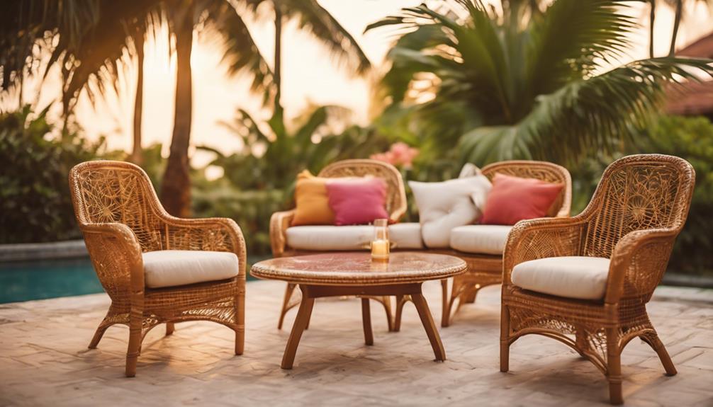
When you focus on three main elements, you establish a sense of visual balance that feels stable yet dynamic. Think about a well-decorated living room: a sofa, a pair of matching side tables, and a central coffee table. Or picture a simple floral arrangement with three different types of flowers. These groupings create a rhythm that guides your eye smoothly across the space, avoiding chaos or clutter. The rule of three helps you avoid overwhelming yourself or your audience, making your design look intentional and polished. It’s about creating a focal point while maintaining harmony, and three is just enough to achieve this without overcomplicating things.
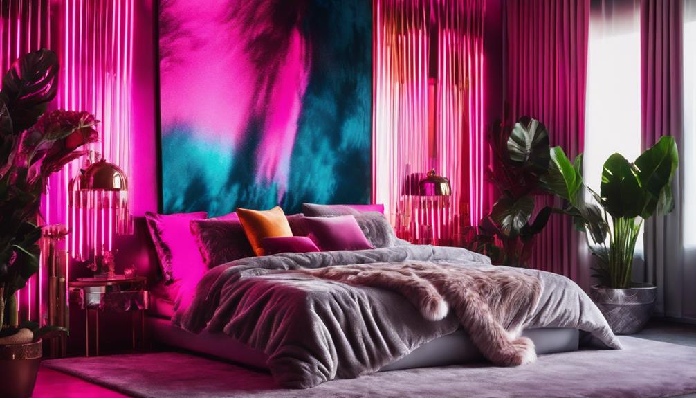
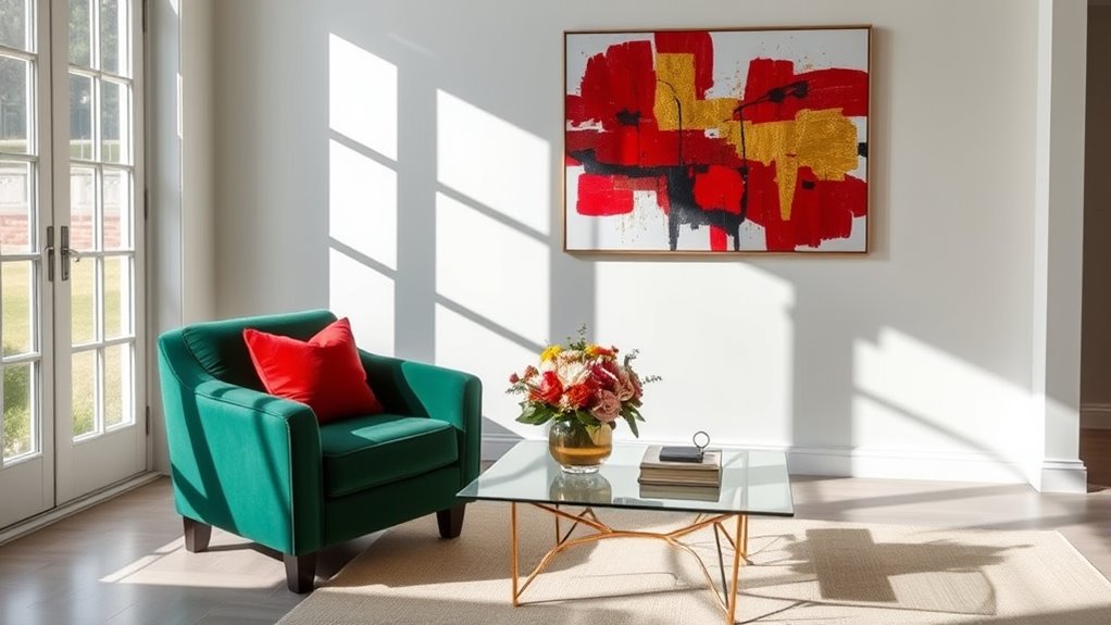
Color harmony plays an essential role here, too. When you select three colors, you set a cohesive palette that ties everything together. Too many colors can feel chaotic, but three allows you to balance contrast with unity. For example, pairing a bold accent color with two neutral shades can make a statement without overwhelming the senses. The rule of three encourages you to pick a dominant hue, a secondary one, and an accent—these work together to create a pleasing visual flow. It’s an elegant way to ensure your design feels unified and intentional, rather than haphazard or chaotic.
Applying the rule of three doesn’t mean you’re limited to just three items or colors, but rather that these are the anchor points around which your entire design revolves. This approach simplifies choices, making your style more cohesive. When you keep three key elements in mind—be it in the placement of furniture, the color scheme, or decorative accents—you naturally create a balanced composition. This sense of harmony is what makes your space or style feel complete and satisfying. The rule of three acts as a guiding principle, helping you craft looks that are both simple and sophisticated, without needing a complex blueprint.
In essence, the rule of three is a timeless trick. It’s about understanding that your brain prefers groups of three because they’re easy to process and remember. Use it to establish visual balance and color harmony, and you’ll find your designs look more intentional, appealing, and effortlessly stylish. Recognizing how visual perception influences our preferences can help you harness this principle more effectively.
Frequently Asked Questions
Can the Rule of Three Be Applied to Digital Design?
Yes, you can definitely apply the rule of three to digital design. It helps create visual balance and enhances color harmony by grouping elements in threes, making your layout more appealing. Whether you’re choosing colors, arranging images, or organizing text, using three items or ideas keeps your design simple yet engaging. This trick guides the viewer’s eye smoothly and makes your content more memorable.
Does the Rule of Three Work for Small or Large Spaces?
Imagine you’re a painter, choosing colors for a vast canvas or a tiny portrait. The rule of three adapts beautifully to both small and large spaces by guiding your use of scale variation and focal points. In large areas, it creates balance through varied elements, while in small spaces, it emphasizes key features. So, yes, the rule of three works across scales, helping you craft harmony and visual interest every time.
How Do I Adapt the Rule for Asymmetrical Layouts?
When adapting the rule for asymmetrical layouts, you focus on creating balance and harmony. Use visual flow by placing your focal points off-center but in a way that guides the eye naturally. Mix different sizes or shapes in threes to maintain interest, ensuring no element feels out of place. This approach keeps your space feeling cohesive, even with asymmetry, by intentionally balancing visual weight across the design.
Is the Rule of Three Effective in Minimalist Design?
While the idea of using just three elements might seem limiting, it actually promotes visual harmony and balance in minimalist design. The rule of three helps you create a focal point without overwhelming the viewer, making your layout more engaging. When you stick to three key components, your design feels cohesive and intentional, ensuring each element contributes meaningfully. Ultimately, this trick enhances simplicity while maintaining visual interest.
Can the Rule of Three Be Used in Branding and Logo Design?
You can definitely use the rule of three in branding and logo design to create visual balance and color harmony. By using three key elements—like shapes, colors, or fonts—you make your logo more memorable and balanced. This approach guides the viewer’s eye smoothly and guarantees your branding feels cohesive. When applied thoughtfully, the rule of three helps your logo stand out while maintaining simplicity and harmony.
Conclusion
By applying the rule of three, you create a natural rhythm that makes your designs more engaging and memorable. This simple trick guides the eye, balances your layout, and enhances overall harmony. When you consistently use three elements, your work feels intentional and polished. So, next time you’re styling, remember that three isn’t just a number — it’s your secret to making your designs effortlessly mesmerizing and visually pleasing. Give it a try and see the difference!